Color
COLOR
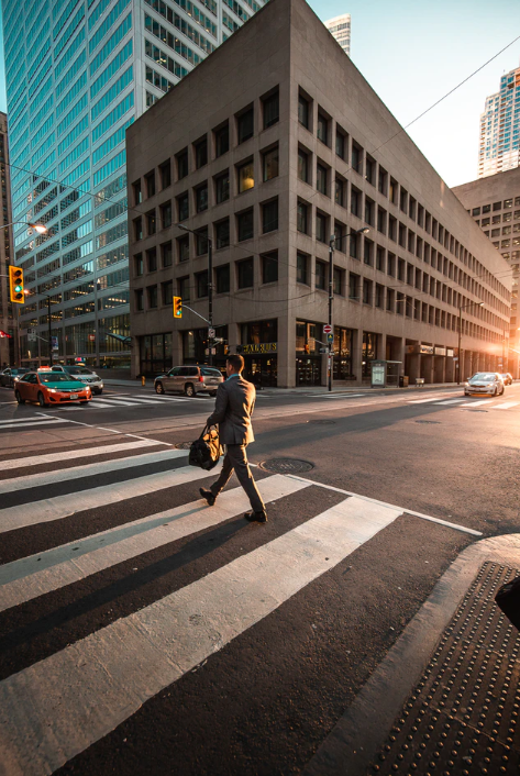
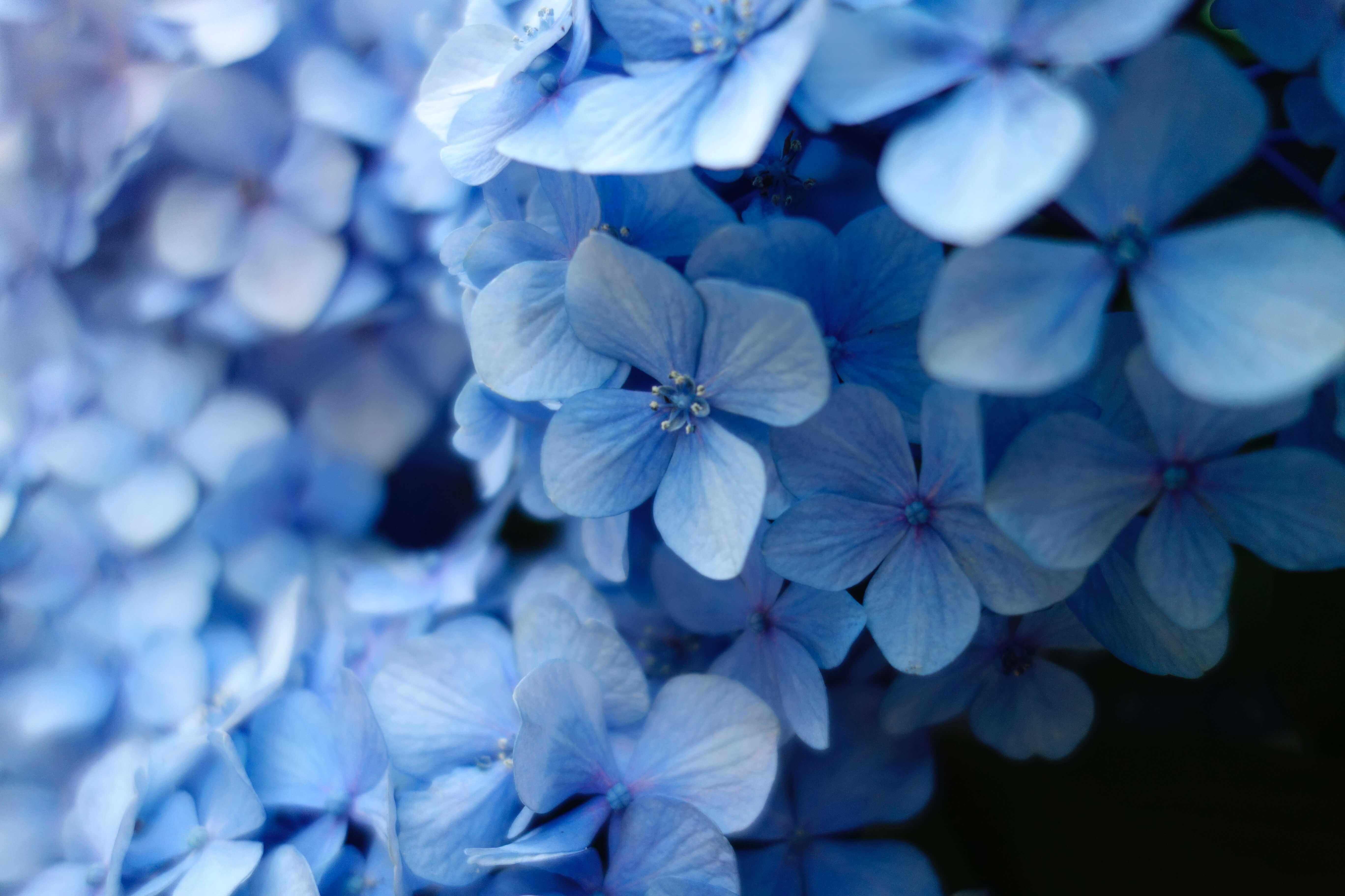
When adding an image to a page, there are a few important things to take into account. Some tips and tricks to use images in the most effective way can be found below, as well as a series of layouts with the pixel width of the image noted in the layout. All dimensions will be noted in pixels (px) unless otherwise specified.
- Images on the site will constrain to their width. This will mean that when working on content in a card, the width will be set, and then the height of the row will constrain to the largest height in that row. If you have a large paragraph of text that has more line height that the height of your image, the image will have empty space below it. If the image is taller than the content around it, the row will be the height of the image. For these reasons, when planning out your content, the most important measurement for an image is its width. (Exception: Jumbotron)
- If you add an image with a width larger than the recommended with for a space, the picture will resize down to the size of the space (proportionally)
- Images have 2 kinds of uses. Cards and Jumbotrons. The card use applies to any image added with a media card, or through the WYSIWYG with the toolbar. The Jumbotron has a constrained image size (see below).
- If you use an image in the WYSWYG you can set a thumbnail size - this size is determined by the largest side of the image. For example, if you select the 650 x 650 thumbnail and have uploaded a 1300 x 650 image, the resulting thumbnail will be 650 x 325, rather than the square that the dimensions imply.
- Jumbotron - The Jumbotron will be as wide as the window you have open. If you have a more narrow window, you need a more narrow image. If you have the widest window on a 14 in screen, you will need a 2115 x 450 image. We recommend no smaller than 1920 x 450 for the Jumbotron. The wider the image the better, although the height will always be 450 px high. Jumbotron images are also the size used in Hero rows on landing pages.
- Featured Image - The Focal Point Scale and Crop on Featured images is set to 1200 x 400px
- Images will alight to the top left corner of the layout they are in, so if an image has a smaller width than the recommended width in a card, it will be at the top right corner of the layout you have selected.
- We recommend that you do not use varying row widths with complex rows including many cards.
- To have images in a row that are the same size - crop the images to the same pixel size and then upload them to the site and add to your page. A free software that helps with resizing is: https://www.birme.net/?target_width=400&target_height=500 which allows you to set the height and width of the photos you are resizing at the same time.
In the following examples you will see layouts exaggerated for the purposes of displaying these points. You will also see many of the same images displayed in different layouts. These images have been uploaded into the media library once, and then are reusable throughout the site.
Note that all uneven column rows are combinations of ratios used in the equal column row examples.
What size space are you trying to fill?
| Space | Fraction | Smallest Width Recommended |
|---|---|---|
| 2 Column Row | 1/4 | 320 pixels |
| 3/4 | 1020 pixels | |
| 1/3 | 450 pixels | |
| 2/3 | 900 pixels | |
| 3 Column Row | 1/4 | 320 pixels |
| 1/2 | 700 pixels | |
| 1/6 | 200 pixels | |
| 2/3 | 900 pixels | |
| Equal Column Row | 1 | 1400 pixels |
| 1/2 | 700 pixels | |
| 1/3 | 450 pixels | |
| 1/4 | 320 pixels | |
| 1/5 | 250 pixels | |
| 1/6 | 200 pixels |
Jumbotron
Width greater than 1920 px (2115 px ideal)
Height equal to 450 px
Equal Column Row, 2 Cards
Width greater than 700 Pixels
Height determined by image and relative to the space (seen to the right, 425px)
Equal Row, 3 Cards
Width greater than 450 px
Height determined by image and relative to the space (Image heights from left to right, 300 px, 580 px)
Equal Column Row, 4 Cards
Width greater than 320 px
Height determined by image and relative to the space (Image heights from left to right, 210 px, 213 px, 477 px)

Equal Column Row, 5 Cards
Width greater than 250 px
Height determined by image and relative to the space (Image heights from left to right, 370 px, 330 px, 160 px, 165px)
Equal Column Row, 6 Cards
Width greater than 200 px
Height determined by image and relative to the space (Image heights about 130 px each)
Sample of photos resized externally and uploaded to the site
Width 250 px Height 312 px
- Red: speed, energy and passion. Red’s a great color to use when you want your audience to take action. Red is often used for ecommerce website color schemes as well as restaurants and takeaway apps—when you’re hungry and ordering a takeaway, you passionately want your food fast!
- Orange: optimism and happiness. Orange is universally seen as a “fun” color and using it in your web design is a great way to show you don’t take yourself too seriously.
- Yellow: warmth, an inviting feeling, positivity. The color of sunshine, yellow is associated with happiness and joy. Super cheerful and accessible. This is a great website color to use for service industries—you’re happy to help!
- Green: nature and health. Calming and natural, green is the perfect choice for a color scheme when designing for a healthy brand. Green is also a great color choice to convey eco-friendliness and sustainability.
- Blue: the most versatile and universally liked. Blue has been shown to inspire feelings of trust, making it a heavy favorite in website color schemes.
- Purple: creativity, wisdom and confidence. Purple is a unique, strong color to use within a website color scheme as it demands attention and stands out.
- Pink: creativity and exuberance. Pink is having the time of its life at the minute, more than ever it’s being embraced by people of all genders and identities, meaning brands are following suit and incorporating it into a range of industries.
- Brown: wholesomeness, warmth and honesty. When used in web design, brown is a comforting color. It gives websites a natural, down-to-earth vibe and often goes hand in hand with traditional, vintage-inspired designs.
- Black: modernity, sleek, neutral. Its minimalism is great for luxury websites; many cosmetic brands adopt black as their key color to signify that their product is quality, which possibly helps you justify spending so much..?
- White: minimalism, transparency. Sometimes the best color choice for minimal web design is no color at all. White is a neutral shade, which means it can easily be combined with other colors for branding purposes. It is primarily used as an accent or background color.
- Gray: maturity, authority. If you’ve got a more serious website, gray is a great color choice, it shows people you mean business.
new and other stuff
Dinosaur Town CouncilDinosaur Council ChambersApril 9, 2024 at 6:00 p.m. MINUTES Mayor, Richard BlakleyDarcie Rocque …